Kendra Creates is based on the Blackburn theme for Hugo. Blackburn is a sleek, light theme and a great starting point, but it didn’t include support for dark themes out of the box. In this post, we’ll look at how I added a dark theme to Kendra Creates.
Credit where credit is due - the code I wrote to add dark theme support is based on the process documented by Atanas Yonkov at Switching Off The Lights Part Two - Adding Dark Mode to Hugo. This provided a starting point, but I took a different approach to achieve a different look and feel.


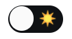
My Dark Mode and Light Mode toggle
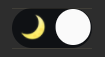
Atanas Yonkov's Dark Mode and Light Mode toggle
Create a Partial for the Toggle
One of the key building blocks of a Hugo website is the partial. A partial is a code snippet that makes up part of a page layout. You’ll find partials in the /layouts/partials/ folder for your theme, e.g. ./themes/blackburn/layouts/partials/. You can create custom partials by adding them to ./layouts/partials/ to use throughout your site. Here, I created ./layouts/partials/toggle.html. This partial includes two things:
- A short snippet of HTML that creates the toggle element.
- A chunk of JavaScript that implements the toggle functionality.
We’ll look at the HTML portion first. Here it is:
| |
I’ve set this up as a list item with the .pure-menu-item class because I wanted it to match the other items in my side menu. Let’s take a closer look at a few areas.
id="js-toggle"- I added an id to this element instead of using classes as Atanas did because I wanted it to have a unique identifier.<i class="fas fa-moon" ... >- I picked a moon icon () from Font Awesome for the “Dark Mode” toggle.id="toggle-icon"- Again, I wanted a unique identifier so that I can get this element to update it.<span id="dark-mode-label">Dark Mode</span>- I added this label in a span with a unique identifier because - you guessed it - I want to get this element and update it when you toggle between light mode and dark mode.
Now that we’ve picked over all the interesting details in the HTML snippet, let’s look at the JavaScript. Here it is:
| |
Here are the changes that I made to create the toggle you see in the side menu:
- Lines 8-11: I added strings that define the icon and label text for the toggle based on which mode it will activate. For example, when dark mode is active, the toggle shows a sun icon () and the label “Light Mode”.
- Line 14: I modified this line to use
getElementById()and the unique identifier of the element. Since this originally usedgetElementsByClassName(), I also removed the array index[0]; the pluralgetElementsmethods return arrays, while the singulargetElementmethods return individual objects. - Lines 18-19: I added these lines so that I can modify the
iconandlabelindependently. - Lines 26-27: When you toggle to dark mode, this sets the icon and label to indicate that clicking this item again will switch to light mode.
- Lines 33-34: When you first load the page or when you toggle to light mode, this sets the icon and label to indicate that clicking this item again will switch to dark mode.
- Lines 43-44: I added these lines to set the icon and label for returning readers who last viewed this page on dark mode.
That’s all of the code that supports the toggle itself.
Customize the Partial for the Side Menu
The toggle.html partial does most of the work, however, the site doesn’t yet know where to use it. Since I wanted to incorporate it in my site’s side menu, I copied ./themes/blackburn/layouts/partials/sidemenu.html to ./layouts/partials/sidemenu.html. I opened up the partial and located the end of the main menu list. It only takes one line of code to insert my new partial before the end of this list:
| |
Line 29 is doing all the work here. Pay close attention to the dot (.) at the end - this is essential for telling Hugo about the context of the partial; learn more about Hugo templates and context here.
At this point, I had an almost fully functional dark/light mode toggle incorporated in my site. I say “almost” because up to this point, turning on dark mode only adds the .dark-mode class to the body of the page - I still need the CSS code to make the actual changes.
Update Stylesheets to Include Dark Mode Styles
The only thing left to do was to set up the dark mode styles. This is just standard CSS, so I won’t go into details about the CSS itself. To pick the dark mode colors, I used the same basic approach I used for my custom light mode: choosing colors from my cover image using image editing software and a color-picker tool. By choosing colors from different areas of the same image, I was able to create a cohesive set of colors that work well together. This isn’t so different from picking paint colors for your living room based off of an upholstery pattern or a painting that you love.
If your website includes code samples with syntax highlighting, you’ll want to configure your site to use style classes for syntax highlighting so that you can switch the style of your code samples using the same .dark-mode class as the rest of your theme. Stay tuned for a future post on customizing syntax highlighting styles.
Final Thoughts
If you’ve been following along at home, you should now have a fully functioning toggle to switch between dark mode and light mode on your Hugo-based website. I hope this has opened your eyes to the world of possibility for customizing an off-the-shelf theme to achieve your desired effect.